Mockup C — "The Graft" (A's slots + B's tear-off and named workspaces)
← all three mockups · ← A — the Workbench · ← B — the Studio
Same job, same canvas, same tabs. This is the "suggested middle" from the proposals doc, drawn: the docked workbench is the base state, but any panel tears off into a real floating window (one is drawn mid-tear below), and named Adobe-style workspaces remember it all per user.
cadmaster
TL-1016-93 · MSO7, 0.125" · sheet 1/1
⌂ Jobs
Workspace: Jordan — Nest ▾
Jordan
Import
Heal
QC
Review
Nest
Cut Plan
Post
Deliver
Layers: ■ healed · ▣ original (gray) · ▢ kit colors
⣿Nest controlstorn off — drag to monitor 2, or re-dock ⇱
Auto-nest draftRepeat × 20 sheets
⣿Nest checks⇱ docked
parts placed41 / 41
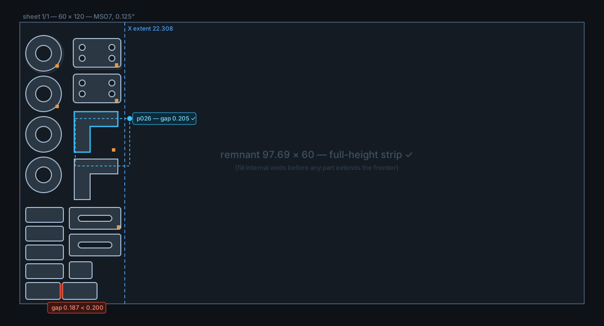
min part gap0.205 (floor 0.200)
X extent / remnant22.308 / 97.69 full-height
open contours0
arcs preserved100% — 0 polylined
⣿Nest controlsempty slot — panel is floating; it snaps back here
▤
▥
▧
Job log & cut-order timeline
14:02 auto-nest draft placed 41 parts in 3.8 s — yield 30/sheet
14:05 Jordan moved p019, p026 into internal void — X extent 23.273 → 22.308, gap check re-run ✓
units: inch (detected)
✓ MetaCam-safe writer armed
⚠ 1 nest flag
X 14.882 Y 31.406
What this one is
The middle, drawn. The base state is A's workbench: every panel in a dock slot, identical on every workstation, nothing can be lost. Grafted from B: (1) any panel tears off into a true floating window — drawn above mid-tear, its empty dock slot waiting behind it — which is how the second monitor works; (2) named per-user Adobe-style workspaces (the same "Jordan — Nest" preset chip as B) remember slots, floats and monitor placement per user per stage; (3) one click on the workspace menu, or on any float's ⇱, snaps everything home.
Why each element is there
It answers both partners at once — Jordan's Adobe-preset instinct and Aristide's "I decide how my real estate works / toolboxes on the extra screen" are both native, while the shared-workstation failure mode (a panel lost off-screen for the next login) is structurally impossible: the dock is always the ground state.
Research fit — the findings reward learnable, visual, consistent UIs (findings 1/3) and punish nothing about docked layouts; they are silent on floating panels. C takes the evidence-backed base (consistency, learnability) and keeps the un-evidenced part (full floating) optional per user rather than default.
All shared elements as in A and B — auto-nest as grabbable draft (finding 6), repeat-nest ×N (finding 7), arcs-preserved gauge (finding 5), live sliders (finding 2), red-glow checks on geometry, status tab strip, lower-right tab markers, gray original base layer, Jobs home door, contextual left toolbar.
Trade-off honestly stated
C costs more than A (the tear-off + workspace machinery is most of B's plumbing) and its floating experience is one notch below B's — panels float, but they don't form free tabbed clusters mid-air; the dock template defines what exists. If the partners want the full Adobe studio as the daily default, pick B; if they want the cheapest solid v1, pick A; C is the one that ages best if both of those pulls are real.
← all three