Mockup B — "The Studio" (free-floating Adobe workspaces)
← all three mockups · ← A — the Workbench · C — the Graft →
Same job, same canvas, same tabs as A — only the panel system differs. Here every panel is a floating window; the workspace menu (drawn open, top right) is the Adobe-style heart of it.
cadmaster
TL-1016-93 · MSO7, 0.125" · sheet 1/1
⌂ Jobs
Window ▾
Workspace: Jordan — Nest ▾
Jordan
Import
Heal
QC
Review
Nest
Cut Plan
Post
Deliver
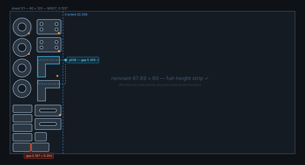
Layers: ■ healed · ▣ original (gray) · ▢ kit colors
⣿Nestfloat ✕
parts placed41 / 41
min part gap0.205 (floor 0.200)
X extent / remnant22.308 / 97.69 full-height
arcs preserved100% — 0 polylined
⚠ p012 ↔ p017 gap 0.187 < 0.200 —
zoom
snap here ▾
⣿Nest controls dragging…
Auto-nest draftRepeat × 20 sheets
monitor 2: Parts table · Job log · Material table (panels live there in this workspace)
units: inch (detected)
✓ MetaCam-safe writer armed
⚠ 1 nest flag
X 14.882 Y 31.406
What this one is
Proposal B from the record, drawn. Every panel is a draggable, snappable window anywhere on any monitor; panels dock into each other as tabbed clusters (Checks | Parts | Sheets above); named per-user workspaces per stage with shipped Essentials presets, and Reset Workspace as the escape hatch. Aristide's extra-screen case is native — a workspace can simply put the parts table, job log and material table on monitor 2. Maximum real-estate control; the exact Adobe muscle memory Jordan named.
Why each element is there
The workspace menu is the centerpiece — Jordan: "when you switch users, we keep track of where they keep their tools and their favorite tool layouts. Maybe an essential preset like how Adobe does." Named layouts per user per stage; switching the Nest→Heal tab can switch the whole panel layout with it.
Aristide's two-monitor case is first-class — his verbatim: "If I have an extra screen, I could even put the toolboxes on the extra screen." No tear-off exception needed; it is just where the windows live.
The canvas gains the pixels the drawer used to take — with panels floating, the 60×120 sheet gets the full width; on a nest this shape that is the single biggest visual win.
All the shared research-driven elements from A are unchanged — auto-nest as a grabbable draft (finding 6), repeat-nest ×N (finding 7), arcs-preserved gauge (finding 5), live sliders (finding 2), red-glow checks on geometry, status tab strip (findings 1/3), lower-right tab markers, gray original layer, Jobs home door.
Trade-off honestly stated
This is the heaviest UI plumbing of the three, and the classic failure mode is the shared-workstation shop: a panel "disappears" for the next login, or floats over the geometry someone is trying to read (the controls panel above is drawn covering sheet — that is real). Mitigations drawn in: per-user workspaces, snap ghosts, Reset workspace one click away. The love/hate research is quiet on floating-panel complaints specifically — it verified nothing for or against them — so the strongest argument for B is Jordan's and Aristide's own Adobe habits, not forum evidence. If the shop floor machine is shared by many hands, C keeps most of this while making lost-panels impossible.
← all three · next: C — the Graft →