Mockup A — "The Workbench" (docked slots, tear-off allowed)
← all three mockups · B — the Studio → · C — the Graft →
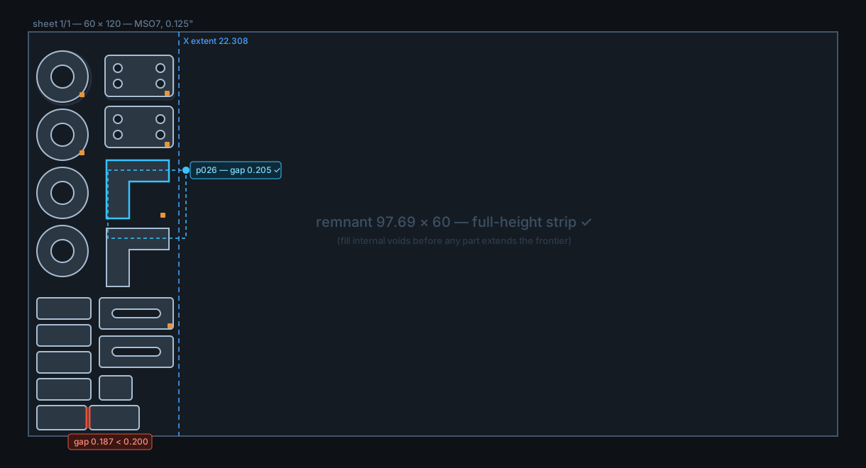
Same screen in all three mockups: the Nest tab of a real job shape (the TL-1016 split60 sheet — 41 parts left-packed, full-height remnant). Only the panel system differs. Geometry is illustrative, numbers are the real ones from build -93.
cadmaster
TL-1016-93 · MSO7, 0.125" · sheet 1/1
⌂ Jobs
Workspace: Jordan ▾
Jordan
Import
Heal
QC
Review
Nest
Cut Plan
Post
Deliver
Layers: ■ healed · ▣ original (gray) · ▢ kit colors
⣿Nest checks⇱ docked
parts placed41 / 41
min part gap0.205 (floor 0.200)
X extent / remnant22.308 / 97.69 full-height
open contours0
arcs preserved100% — 0 polylined
envelope 80×160inside
⣿Nest controls⇱ docked
Auto-nest draftRepeat this nest × 20 sheets
objective: minimum X ▾
▤
▥
▧
Job log & cut-order timeline
14:02 auto-nest draft placed 41 parts in 3.8 s — yield 30/sheet
14:05 Jordan moved p019, p026 into internal void — X extent 23.273 → 22.308, gap check re-run ✓
14:05 check 1 flag open: p012↔p017 gap 0.187
units: inch (detected)
✓ MetaCam-safe writer armed
⚠ 1 nest flag
X 14.882 Y 31.406
What this one is
Proposal A from the record, drawn. Every panel lives in a dock slot: tools in the left column, the checks/numbers drawer on the right edge, the job log / cut-order timeline in a bottom strip. Panels drag between slots and collapse to the thin icon strip; any panel can be TORN OFF into a floating window — that is how the second monitor works — but on one screen everything not floating snaps back to a slot, so a panel can never be lost. Per-user workspace = which panels sit in which slots. Cheapest to build, novice-proof, identical on every workstation.
Why each element is there
Jordan's picture (verbatim basis) — canvas owns the screen, toolbars in a left column, the eight workflow tabs across the top left-to-right, per-user remembered layouts. All three mockups share this; it is the accepted direction, not a variable.
Tab strip with status dots — Import/Heal/QC/Review green (done), Nest active with a yellow flag, downstream gray. The job's state reads off the strip from across the room. Learnability and visual-first are what won LightBurn its market (research findings 1 & 3).
Auto-nest is a DRAFT button, parts stay grabbable — research finding 6: operators call auto-nest "sloppy and wasteful" and hand-edit routinely; the documented 30→41 parts/sheet rescue was a 3-minute manual re-nest. Here the auto result is a starting point and dragging a part is the primary gesture — the selected part (cyan) shows a live gap chip while it moves. Jordan's own p019/p026 moves are this exact workflow.
"Repeat this nest × 20 sheets" — research finding 7: a repeated identical nest builds the floor crew's stripping rhythm; "20 slightly different nest results makes a mess."
"arcs preserved 100% — 0 polylined" as a standing check — research finding 5: deepnest polylining arcs got its files refused outright. Our never-polyline rule surfaced as a visible, always-on gauge.
Live sliders with instant feedback — research finding 2: the beloved LightBurn pattern (drag, see the result instantly on the geometry, no dialog-OK-look loop).
Checks live ON the geometry — the too-close pair glows red on the canvas with the number beside it; the drawer holds the same fact as a row that zooms to it. One dataset, two views (and the drawer defaults RIGHT because check lists are vertical and a 60×120 sheet needs the bottom pixels for canvas).
Grabbable orange tab markers, lower-right bias — tabs are markers you can drag along the contour; default placement follows the lower-right ruling (Aristide 08-13, Jordan 08-14).
Original as toggleable gray base layer — the standing interface requirement from CLAUDE.md, shown top-right of the canvas.
Jobs home behind the ⌂ button — Aristide's ruling: the front door is the jobs board (plus browse-a-folder and draw-from-scratch intake); the canvas is one double-click deep. Same in all three mockups.
Trade-off honestly stated
The ceiling on real-estate control is the slot system itself: Aristide's "I decide how my real estate works" is only satisfied through tear-off, not full free placement. If the partners want the Adobe muscle-memory experience as the default rather than the exception, this is the wrong pick and B or C is the answer.
← all three · next: B — the Studio →